


Tracking the Covid waves: how to interpret Covid numbers
Quick post on the important biases in Covid data if wanting to understand levels of infection in the population

I recently did a long post looking at all the data we used to be able to draw on to understand the state of the pandemic, and another on the current Covid situation in the UK, using the much reduced data resources we have available now.
So I thought it would be worth doing a piece on the inherent biases that come with almost any data set comes with inherent biases. These biases need to be borne in mind when trying to use Covid case, admission and death data to understand numbers of people infected, and whether things are getting better or worse. This is especially important if wanting to compare data over time or across different countries.
Interpreting case numbers
Case numbers have been the most common and up-to-date measure of the state of the pandemic - but are not without issues.
A person with Covid only becomes a reported case if they test positive. That sounds obvious, but it depends on the likelihood of getting tested and the accuracy of the test. Getting tested depends on either being part of a regular testing programme (e.g. hospitals and schools in 2021) or on having symptoms of Covid, recognising that you have symptoms of Covid, then choosing to get tested, having access to a test and, finally, the test correctly indicating that you have Covid.
UK surveys showed that only about 50% of people could identify the main symptoms of Covid even in the summer of 2021; NHS and government sites did not expand the list of Covid symptoms until after free testing stopped in March 2022; and people who could not afford to isolate or miss work were much less likely to test. Waves of Covid could lead to severe test shortages (e.g. September 2020 or December 2021) which also restricted who would appear in the case data. Lateral Flow Tests (LFTs) made testing much more accessible and rapid in 2021, but were less accurate than PCR tests.
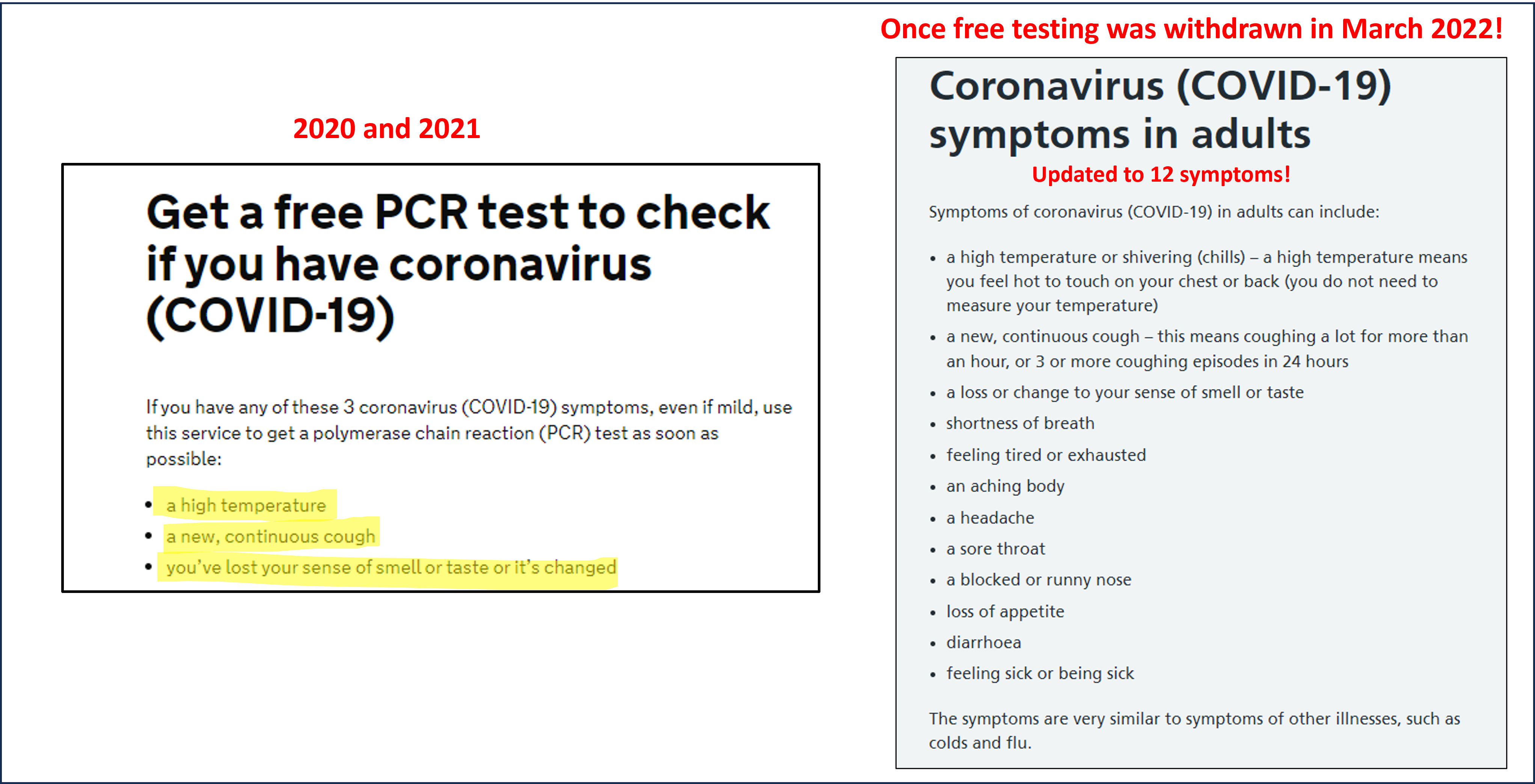
Once free LFTs were withdrawn in March 2022 (after most free PCR tests stopping in January 2022), appearing as a case became almost increasingly impossible. Only free NHS lateral flow tests are reportable to UKHSA. So as people ran down their stocks of free pre-March 2022 tests, cases increasingly reflected people in hospital with confirmed Covid (automatically counted), and those workers and immuno-compromised people eligible for free NHS tests.
So when looking at data of case counts remember that before March 2022 case numbers will be missing many people without symptoms (who also tend to be younger), will miss those who didn’t get tested because they didn’t realise they might have had Covid, and will under-represent people on low income or in insecure work (who were often also most exposed to infection). The extent of these biases will change over time e.g. as people think more or less about Covid or tests are more or less easily available. After March 2022, case data is skewed towards a very specific population and is both less useful and not comparable to previous case data.
The best, gold standard, measure of levels of infection in the population are surveys of randomly tested people, such as the ONS infection survey, but this was always lagged by a few weeks and most countries do not have such surveys.
Interpreting hospital admission data
The number of people admitted to hospital with Covid is, in its own right, a key adverse outcome of Covid - both for those severely ill with Covid and for adding pressure to health care systems. But the number of admissions has also been used as a way of tracking levels of infection in the community, and this can be problematic.
Firstly, admissions from Covid tend to reflect infections 7-10 days earlier and so are less informative about the current situation than reported case data. Secondly, people admitted to hospital with Covid (whether with or due to) tend to be older adults, and so just looking at hospital admission numbers can miss what is happening in children and younger adults.
Thirdly, comparing hospital admissions over time or across countries - particularly after 2021 - as a proxy for the number of infections is problematic because the timing, number, type and recipients of vaccines makes a massive difference to the number of people who get sick enough to need hospital. Added to that are changing criteria as to who is getting tested in hospitals (in England for instance it used to be everyone and has gradually reduced to far fewer people now), and different criteria across countries on who exactly counts as a Covid admission (e.g. some countries include “suspected” Covid, while others don’t). The final bias is in hospital capacity: for countries that experienced waves that overwhelmed their health care systems, or came close to it, not everyone who needed hospital got access to hospital - artificially reducing the number of recorded Covid hospital admissions.
Interpreting death data
The most serious outcome of a Covid infection is death, and the number of Covid deaths will always be a key (but not the only!) measure of the impact of the pandemic. But people have also used death data as a way of gauging current levels of infection - often to imply there’s little to worry about. Death data should never be used as a proxy for current infection levels.
This is because the number of deaths on any given day reflects the number of people who were infected several weeks earlier. And not just the number of people infected, but, specifically, the number of elderly or more vulnerable people infected weeks earlier (as they are at much higher risk of dying from Covid). Especially during phases of rapid exponential growth in 2020 and 2021, and especially in waves starting in children or young adults, current infections could already be orders of magnitude higher than a naive look at the current numbers of deaths would suggest.
Instead of using current numbers of deaths to infer anything about levels of infection and the course of the pandemic, we need to flip it round and use data on current levels of infection, preferably disaggregated by age, to infer future numbers of deaths. Over three and half years into the pandemic, I still get contacted by journalists for comment every time recorded Covid deaths increase in the UK. Inevitably they ask, “Are you surprised?”. I have never been surprised, because cases and hospitalisations would have started to increase a few weeks earlier. Current trends in infections and hospitalisations will tell you very reliably what to expect from deaths in a few weeks time.
The consequence of this (especially in 2020) is that waiting to implement protective measures until cases are very high means that the next few weeks of increasing deaths cannot be avoided, because those people have already been infected.
Comparing deaths across countries is also fraught with difficulty, as different countries counted Covid deaths differently. These differences are not obvious from the website that collate that information, but they do matter.

Summary
I have covered some biases to be aware of when using cases, admissions and deaths to try to understand levels of infection. Many other biases exist and become important when considering different aspects of the pandemic, such as the impact of public health measures or the impacts of Covid waves. If you want to read more, do check out this article Kit Yates and I wrote for Science Magazine in 2021.
I hope that this post is useful both for interpreting data from the first months and years of the pandemic, but also in understanding the (limited) inferences we can draw from the data available today. A general rule of thumb in interpreting any epidemiological data set is to first ask how people get into the data set.
It is awful not to be able to rely on the data & thus not able to ascertain risk. Feels like walking on a tightrope. It is criminal what these governments are doing to people.
Thankyou for your incise explanation- very interesting informative and helpful !