


Here yesterday, gone today: Data of Covid Past
A retrospective tour through the Covid-19 data we used to have, what it meant and what it means now...

I did a deep dive into the latest Covid numbers in the UK yesterday and there was lots still to say - but also lots I couldn’t say, because the data simply does not exist anymore. There has been a slow attrition over the last 18 months in the quality and quantity of data available to understand the current Covid situation - slow enough that perhaps we don’t mourn the loss as much as we should.
We’ve lost data on where infections are happening and in whom, data on Long Covid, on inequalities, on who is getting tested, on what is happening in schools, or what the population thinks of it all. As other countries have massively scaled back their reporting, we’ve also lost some of our ability to learn from each other.
In this post, I’m going to revisit the breadth and depth of data we once had, and what it meant.
As the Inquiry Module 2 kicks off this week, going over decisions made in 2020, remembering what data - and information from that data - was available back then is even more important.
Contents
Each section is pretty short, but have added navigable links below for ease!
Data on new confirmed cases
Back when testing was free and frequent, the UKHSA Covid dashboard was updated every day and we had incredibly fine-grained levels of insight into what was happening with Covid in almost real time.
We could use positivity rates to compare across regions, and dig down into individual boroughs, allowing detailed analysis of the impact of the geographically-based measures we had in the autumn of 2020.

In fact, we had so much data, we could go further and look at age structure within small regions, allowing us to understand hotspots, e.g. this surge driven by school aged children in Kettering in the autumn of 2021.

We could track cases through age groups and deprivation - such as this plot from UKHSA in 2020 showing that working aged adults from more deprived communities were being disporportionately exposed to infection.

While case data and positivity rates are still being collected, there is so little testing going on (or at least, reporting of tests (especially since you can’t report privately bought tests for some crazy reason!)), that it is hard to infer much about the current situation from these data and I, at least, no longer use this data for my Covid updates.
Data from Test and Trace
NHS Test and Trace started in the summer of 2020 and pretty soon there were detailed weekly reports with downloadable data, with information about the number of people reached, time to reach, contacts provided and geographical, age and gender breakdowns. From the beginning it was clear that we weren’t reaching enough contacts (particularly non household ones), and not quickly enough. We could see the (predictable) crunch on test availability and processing in September 2020, we could see worse performance in areas with high cases and high deprivation. We could also track where contacts were happening. What Test and Trace never really got a handle on however, was how many people were actually testing (the first crucial step) and how many were actually isolating (the final crucial step), although some of that was collected through commissioned SAGE research.

Data on prevalence
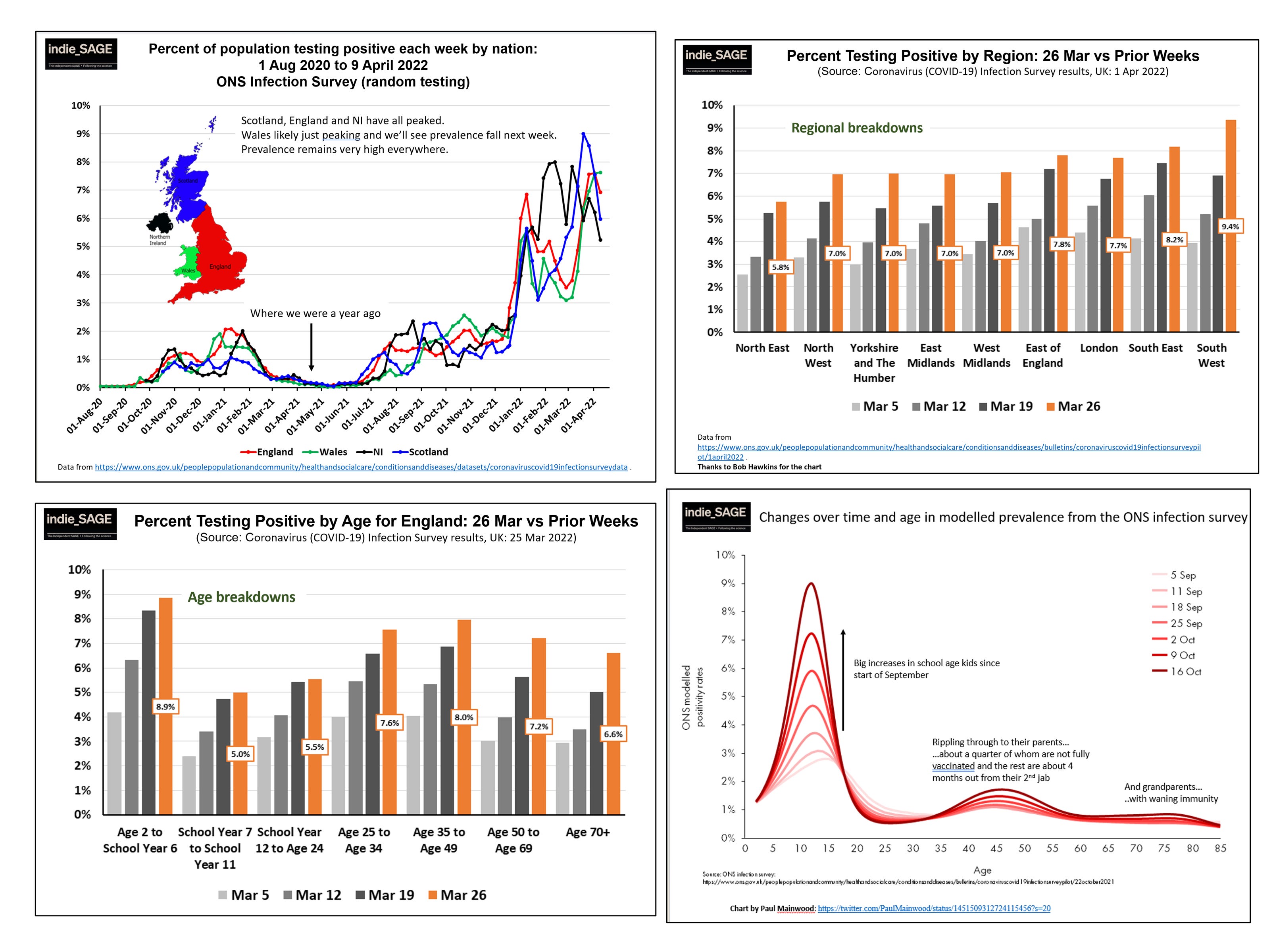
ONS infection survey: 2020 - March 2023
This was the gold standard on how much infection there was in the community, based on testing tens of thousands people every week. It didn’t depend on people having symptoms, or seeking testing, and it covered a representative sample of the population. We could assess prevalence over time, between home nations, across regions and across age groups. It allowed beautiful analysis, such as shown on the bottom right in the chart by Paul Mainwood, tracing how large infection waves in children then (likely) spread to their parents and grandparents.
Imperial College REACT Study: 2020 - March 2022
For 1.5 years we were lucky to have the Imperial REACT study, which tested a representative random sample of 100,000 people every month, augmenting the ONS infection survey. Not only did we get great prevalence data by age and region, but we also got detailed demographic data on infections, which provided crucial evidence that key workers, minority ethnic populations, those in larger households and those from more deprived communities were at significantly higher risk of becoming infected.

Wastewater data: 2020 - 2022
Measuring the amount of Covid in wastewater can’t tell you exactly how many people are infected, but it is a relatively cheap and easy way to have some idea of levels of infection in the community. England had a pretty good wastewater monitoring programme going, which priovided detailed regional estimates - but the whole programme was ended in March 2022.

Wales kept its wastewater monitoring going for longer but that then stopped this summer, leaving Scotland the only home nation still collecting data, but its publication is somewhat intermittent.
Data on Long Covid
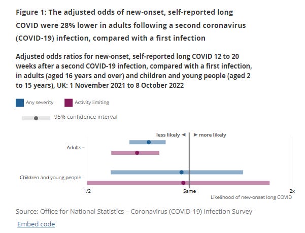
The ONS infection survey was also one of the world’s only representative, real time, trackers of the number of people reporting living with persistent symptoms after a confirmed Covid infection (Long Covid). While there are some issues with using only self-reported data, nonetheless this survey provided the best estimates of how common perisistent symptoms were.
We could just see how many people reported long term symptoms (at both 4 and 12 weeks after (first) infection, around 2 million at last count in March 2023), but also how severely this affected their daily lives, how old they were, what jobs they did and whether they lived in more deprived communities.

The ONS team could also do really cool & important things like explore how common Long Covid was after Omicron infection in fully vaccinated people (about 4%) or how common it was after reinfection with Covid (2.4%). Still the most reliable estimates out there!
Additionally, the Imperial REACT study provided some really important early insights into Long Covid, including duration of symptoms, most common persistent symptoms (fatigue and muscle aches) and risk factors for developing Long Covid.

These surveys following a representative proportion of people over months and years, and knowing when they tested positive for Covid (without relying on symptoms or testing behaviours), were incredibly powerful for understanding more about Long Covid. And now they’re gone. When new Covid infection waves happen (as currently underway), we simply won’t be able to measure the resultant impact of Long Covid.
Data on schools
The Department for Education and UKHSA used to publish detailed data useful for understanding the impact of Covid on schools. We could track how many pupils and teachers were out of school because of Covid, how much testing was going on and where there were outbreaks. The data were clear in showing rising rates during term times, reset (partially) during holidays and half terms. The first Omicron wave in January 2022, for instance, caused very significant disruption with almost 9% of teachers absent. Covid-specific data collection and reporting stopped in March 2022.

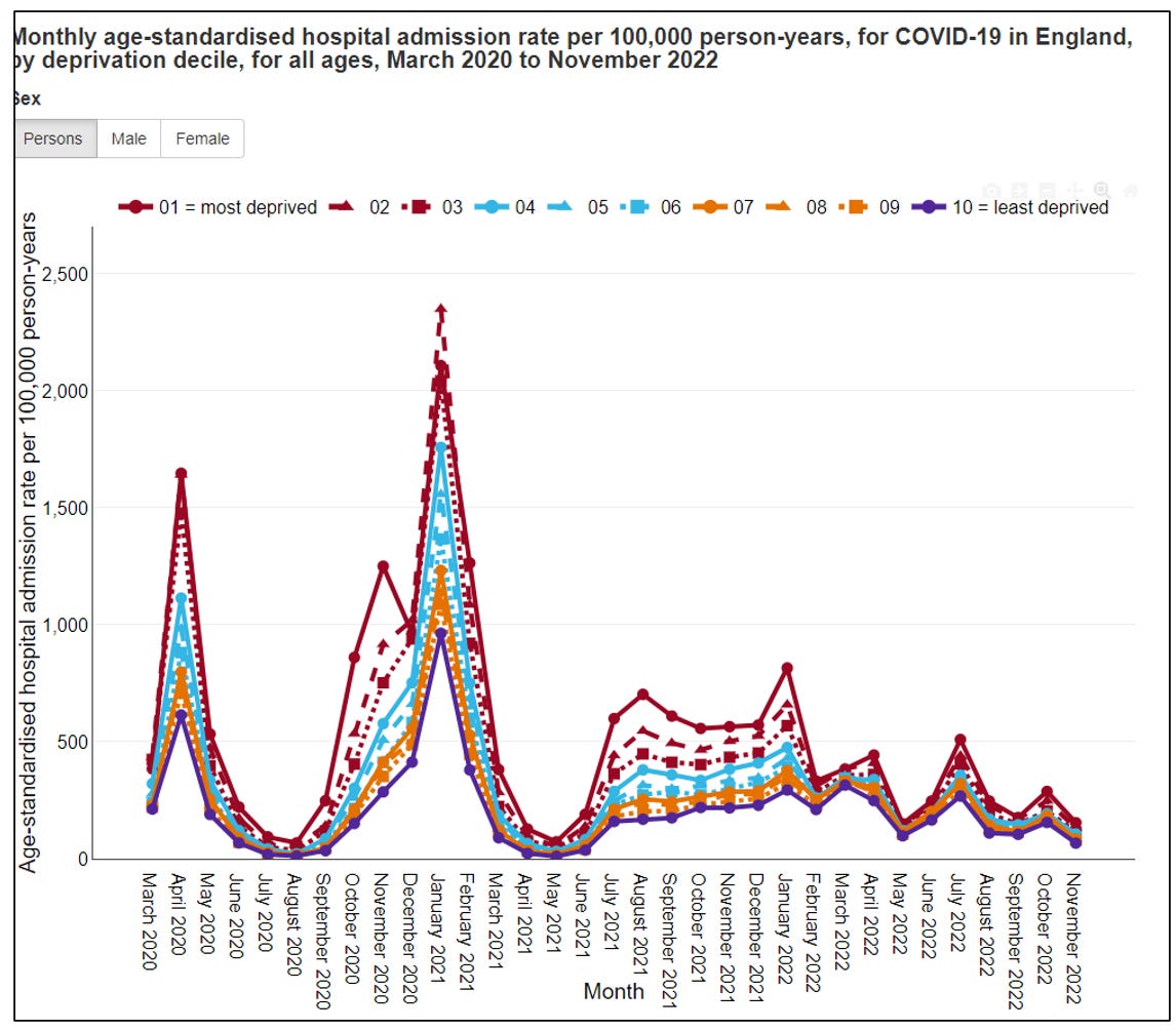
Data on inequalities
It became clear in the first two waves how much Covid exacerbated existing inequalities, as those from more deprived communities were more exposed (through work, transport & housing), more at risk from infection (through existing health vulnerabilities) and less able to isolate to keep their households and communities safe. The Public Health CHIME reporting tool was a brilliant portal for exploring the impact of different demographic measures on outcomes such as hospitalisation or death. It too is gone, stopping reporting in March 2023.
Data on new variants
While we are still sequencing PCR tests and learning about new variants - and the UK is a world leader in this - we are now testing so little (we were doing a hundred-fold more PCR tests back in 2021 compared to now!) that we are seeing new variants quite late and have lost the detail we used to have on exactly where they were spreading. In contrast, we had very early warning of Delta in the spring of 2021 and could track quite precisely where it was spreading.
Data on what the public did, and what they thought about it
The Office for National Statistics (ONS) conducts a whole range of surveys all the time. It quickly repurposed some of these to understand attitudes to, and impact of, Covid on the population. This was important to understand adherence to public health measures - after all measures only work if people do them - but also how the pandemic was affecting people and what that might mean for measures in the future. ONS has gradually asked fewer and fewer questions about Covid in its regular surveys.

SAGE reports
The government advisory committees, under the overall umbrella of SAGE, were stood down in 2022. While they were active, their many minutes and special reports provided a huge amount of data and information. While these were not published in real time, they were nonetheless rapid enough to provie a valuable source of data. Their status updates provided assessments of the state of the pandemic and its future possible trajectories over the coming months; assessments of the efficacy of different measures to control spread; and deep dives into policy options such as school opening or financial support for isolation.

International data
Finally, there was a wealth of data from around the world that was particularly valuable over the first 12-18 months of the pandemic. As countries emerged from the first wave of Covid-19, they tried different things at different times to control transmission. International data from countries with early waves provided warnings for those countries that came later (should they choose to heed those warnings), but also information on what measures worked.
We could see very early that reopening hospitality and international travel led to case increases in Europe. We could see August school opening in the US leading to school outbreaks. We could also see that some countries, like South Korea, maintained suppression without lockdowns. This was invaluable knowledge as the UK opened up in the summer of 2020 - although it is not obvious that the government acted on this knowledge (e.g. Eat out to help out in England).

As summer moved into autumn in 2020, we could track how further lockdowns or less restrictive public health measures affected cases and hospitalisations; how public holidays increased transmission (e.g. Thanksgiving in the US & Canada) as Europe considered Christmas policies; and how some countries managed to control substantial autumn waves without lockdowns, often through excellent contact tracing and isolation of cases and contacts.

As we moved into 2021, we could track each country’s vaccination progress and watched carefully as new variants emerged and spread, including Delta in Spring 2021 and Omicron in December 2021. Now we face two barriers to learning from other countries: firstly that countries have drastically scaled back their data collection and reporting, and secondly that a combination of different timings and numbers of Covid waves, different variants, different vaccines and vaccination coverage, different policies and different population demographics mean that it is much harder now to learn from one country’s recent experience to inform policy in another. Exceptions are things like major new variants, or specific policies in special contexts (e.g. cleaner indoor air in schools).
Summary
As the length of this post attests, we have had an incredible amount of data available to us. The quality and quantity of data across the UK deserves great praise and enabled crucial insights into the possible course of pandemic, and the measures possible to change that course. We also had expert synthesis across the various data sources that could have informed policy, e.g. from SAGE, the Royal Society, Independent SAGE and others. In my opinion, the great failing was that too often this knowledge was not used by government to inform policy. As the UK Inquiry delves into the first year of the pandemic, I hope that this retrospective of available data can be a useful framework for placing the emerging information in the context of what was known and knowable.
Thank you Christina for all you do.3+ years of no covid thanks to you and Independent Sage.The lack of public health information is criminal récent court case in France bought by the familly of a dr infected at work proves the only way forward to ensure safe work spaces for médical professionnel & patients is through litigation.It shouldn't have to be this way.
Thank you 🙏 the loss of data is an ideological choice that makes it impossible to make informed decisions as a member of the public.